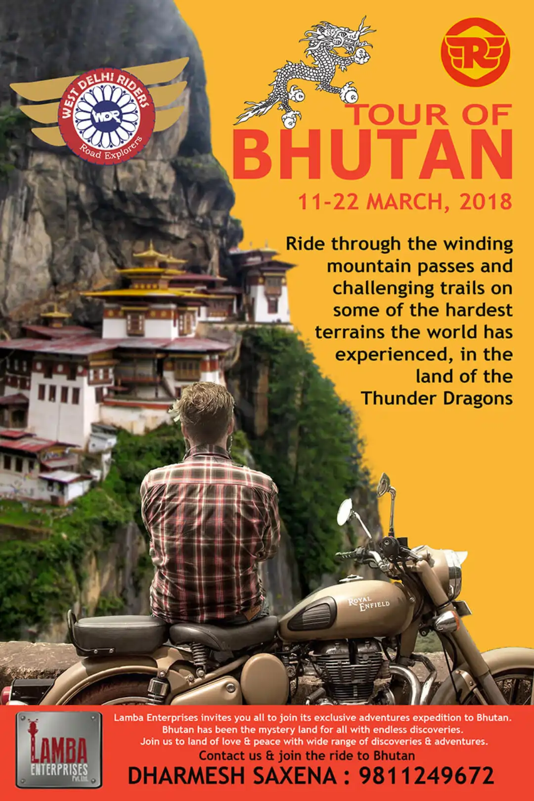
Making WDR Logo
THE INSPIRATION BEHIND THE LOGO
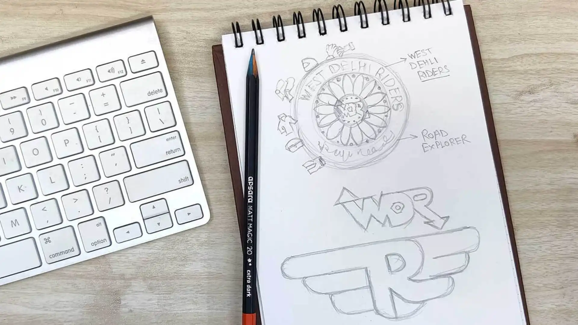
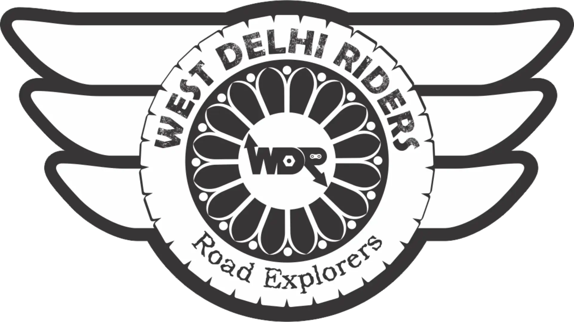
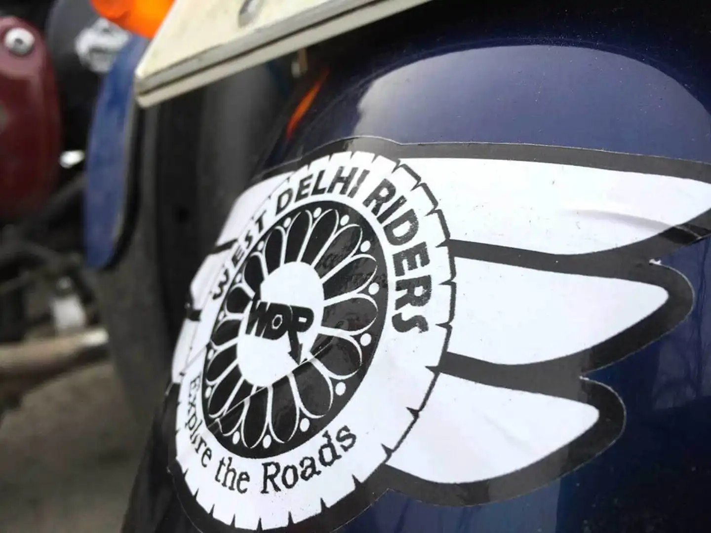
A logo was created specifically for the biking community, embodying the spirit of riding and cultivating a strong sense of camaraderie among enthusiasts.
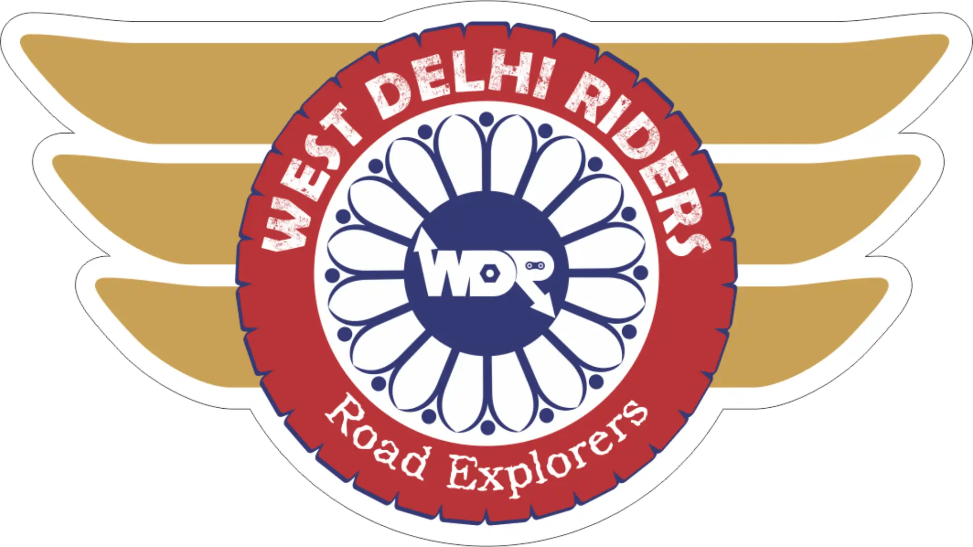
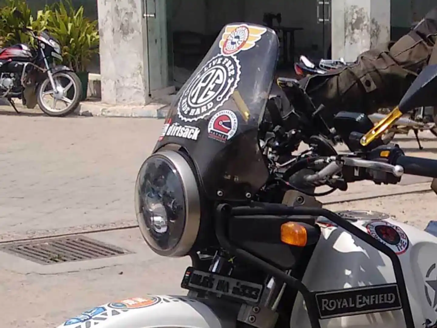
1. With a nod to Royal Enfield bikes, the design incorporates elegant wings, seamlessly connecting this logo with the iconic RE brand.
2. Instead of using traditional spikes, we opted for hands to symbolize the powerful bond of ‘brotherhood.’
3. At the heart of the design, a nut proudly displays ‘WDR’ (an abbreviation for West Delhi Riders), where the letters W and R represent distinct directions, reflective of the adventurous spirit.
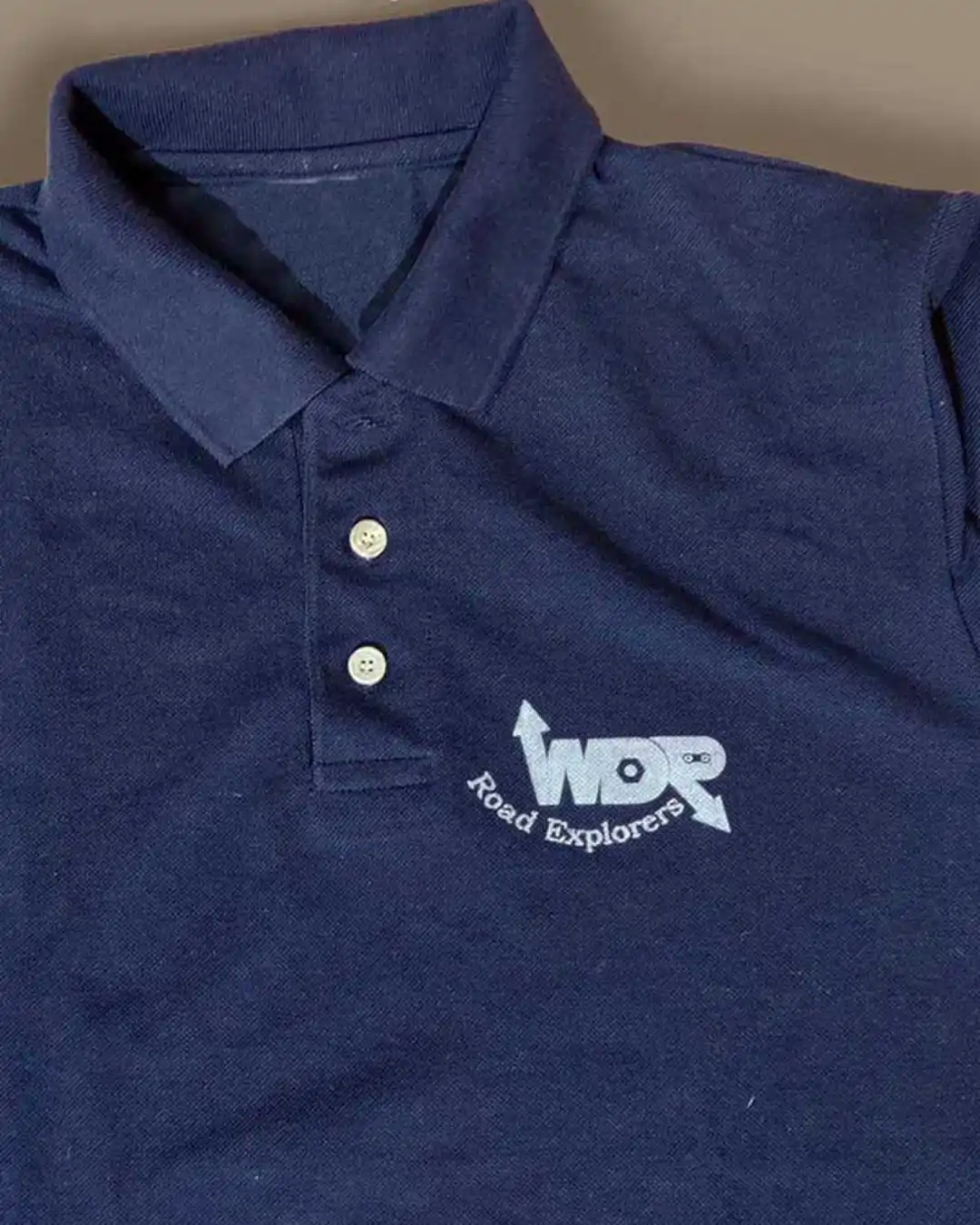
4. Embracing the essence of exploration, the tagline of WDR is ‘Road Explorers.’

Merchandising
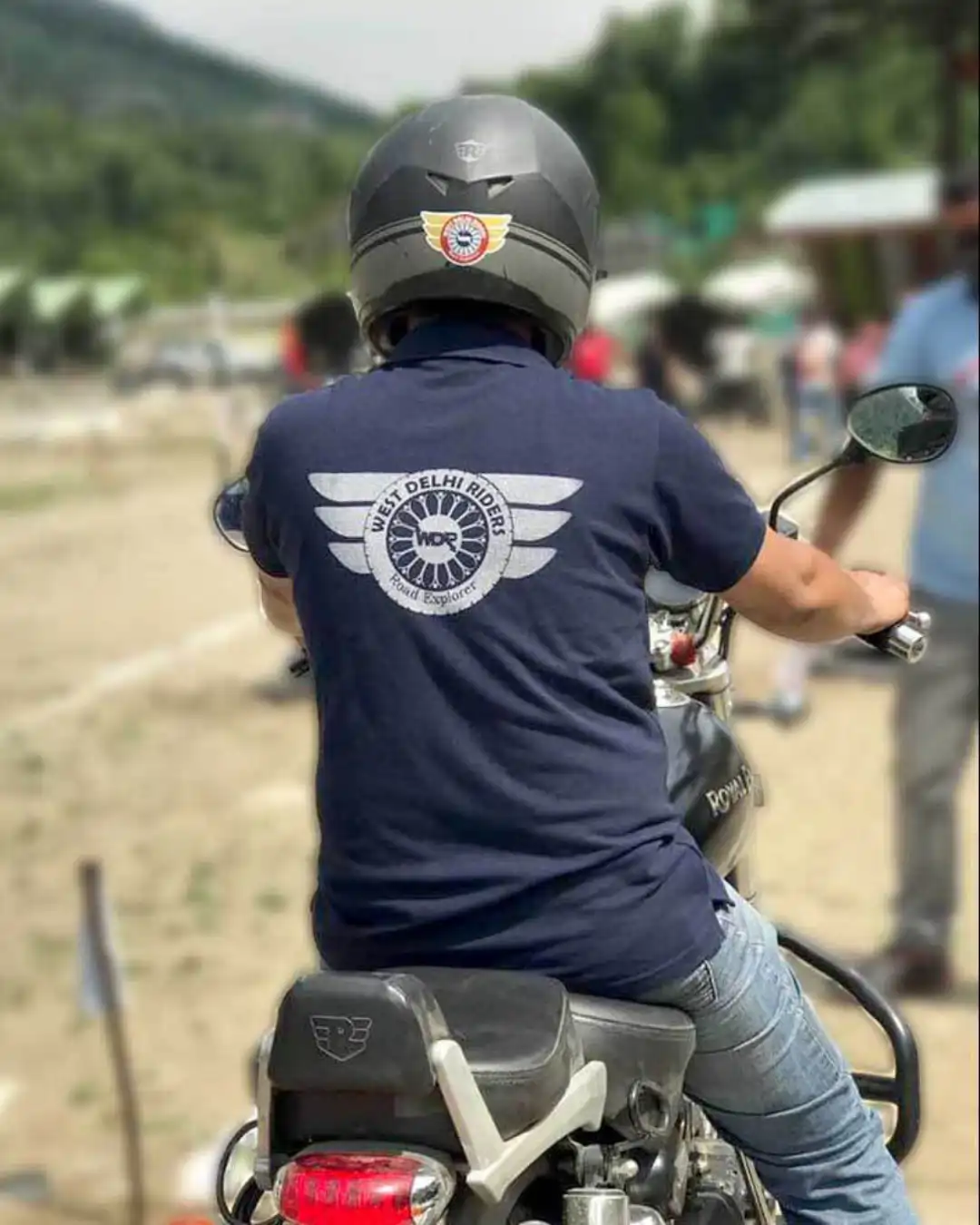
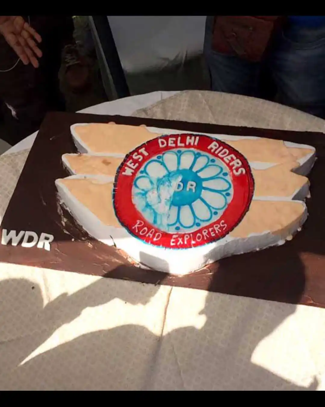
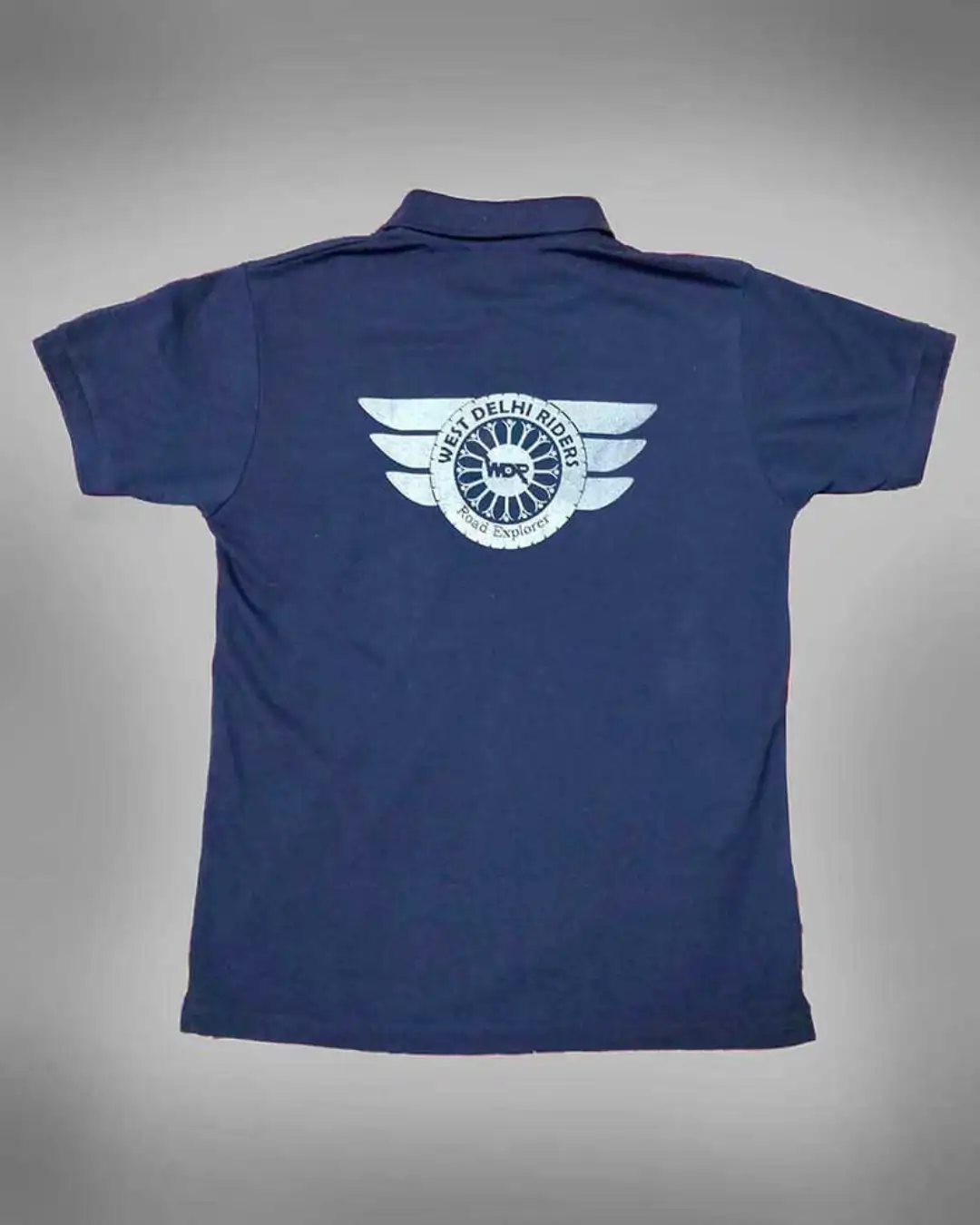
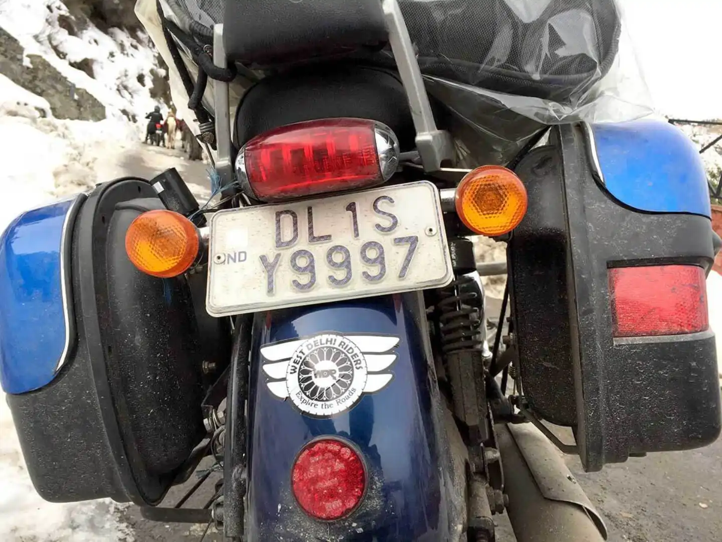
Designed a diverse range of branded merchandise—including T-shirts, cakes, decals, and more
Preparation for LADAKH Trip
Designed logo, poster, decals for the trip
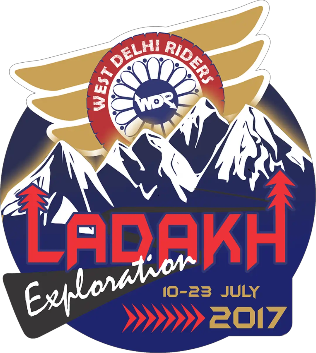
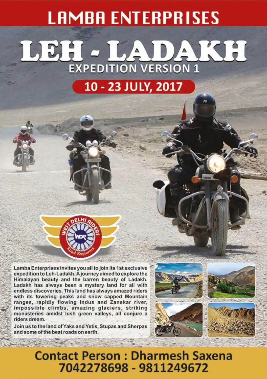
Crafted a Unique Monogram for Ladakh Expedition to Easily Identify Bikes
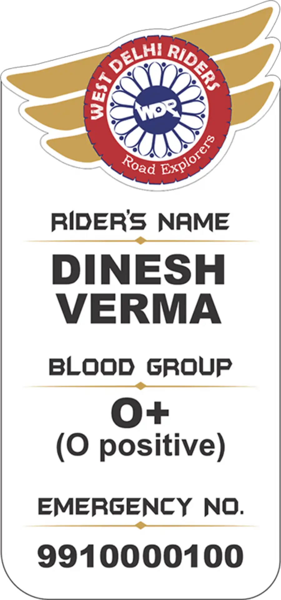
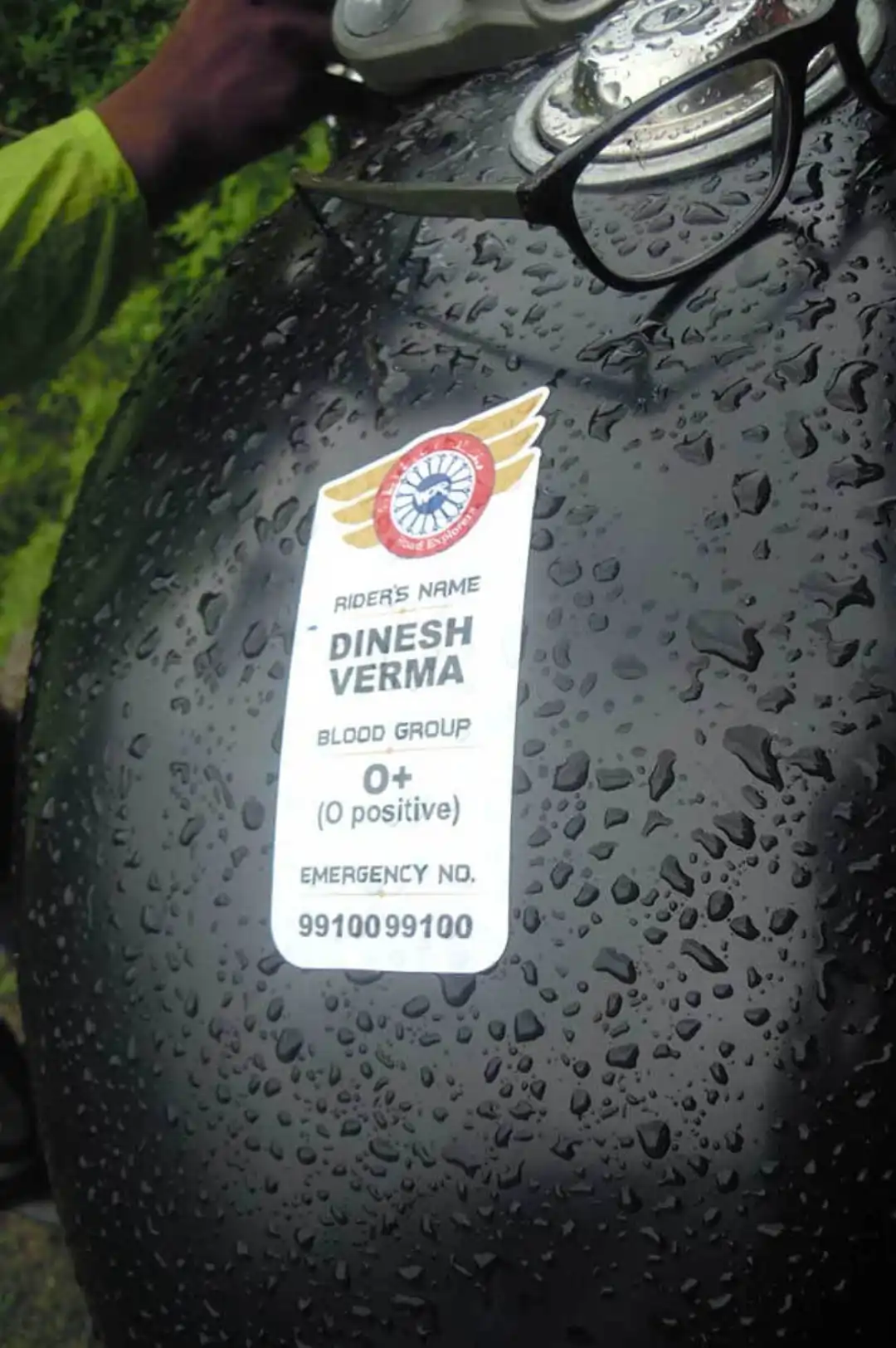
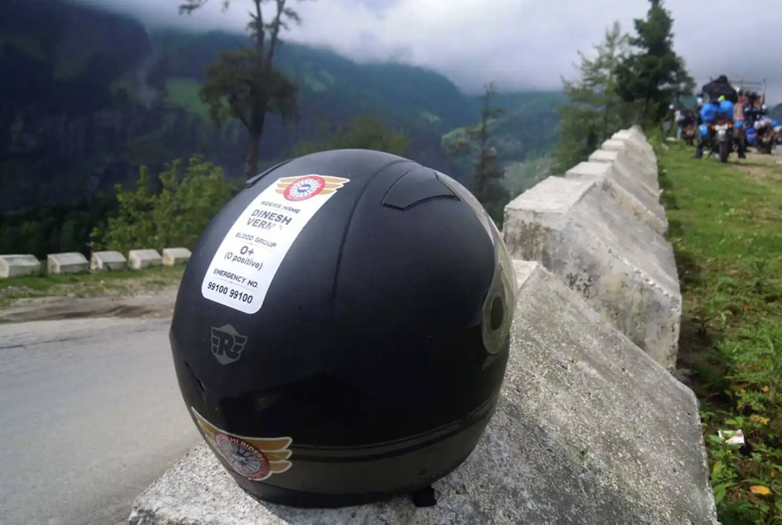
Created a customized emergency label for rider identification—featuring essential personal and medical details for quick access. Also proposed optimal placement zones on helmets and bikes to ensure maximum visibility and rapid recognition during emergencies.
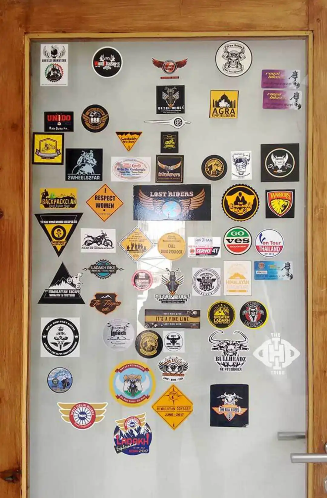
WDR Logo STANDS OUT
on the ‘Hall of Fame’ window, among other riders’ groups logos